Experiential Retail Needs to Die
You make your way to the end of a line wrapped around two New York City blocks.
You purchased these tickets weeks ago but you’re still relegated to stand with all the other sweaty, #basic schmucks in the 95 degree humidity.
There are children – a rare sight in the Meatpacking district – fidgeting in anticipation (or iPad-withdrawal).
After two hours, you finally cross the threshold into a technicolor nightmare. It’s like a lactose-intolerant unicorn vomited all over a Yayoi Kasuma installation.
You shuffle through the six room “maze”, simple enough that your brain can avoid any unnecessary activity beyond pure sensory stimulation (and so that you don’t take too long).
They try to sell you something. Maybe you give in because, hey, you’re there and you guess it’s kind of cute. Maybe you don’t, because you certainly don’t need a soft serve-shaped pillow and who wants to carry an extra bag to brunch anyway?
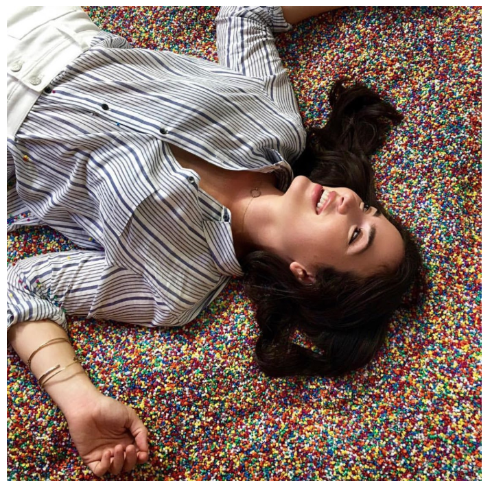
Ten minutes later you leave, with a few artfully-staged, soon-to-be-Facetuned selfies and a two-second Boomerang in a sprinkle pool. A little older, certainly not wiser (maybe even a little dumber?), with just one question lingering.
What was the point?

*It’s me. I’m in the sprinkle pool.*
What is a PIE?
The second half of the Age of the Personal Brand (as the 2010s will be known by our AI overlords in decades to come) was inundated with these “Pop-up Instagram Experiences” (PIEs) – irredeemable transitory events with no utility beyond a single photographic souvenir: an Instagram post (or maybe a Story, if you didn’t get a good enough pic). Experiences where the photo is not intended to commemorate a joyous event but where the photo is, in itself, the objective.
PIEs have become so trendy in the startup community that you’d be hard pressed to hear any consumer brand pitch that doesn’t reference their supposed “viral success”.
And it’s easy to see why.
More than 1.5 million people have reportedly visited The Museum of Ice Cream since it launched in summer 2016. The model – sometimes described as an “interactive art experience” as opposed to PIE, as I like to call it – has been replicated ad nauseam in magic, kids, colors, and pets, to name just a few. And consumer brands are eager to demonstrate potential virality to venture capitalists as online network effects dwindle thanks to the decreasing efficacy of digital marketing.
And so, consumer retail 2.0 and PIEs merged into a dominant buzz-phrase du jour: Experiential Retail (ER).
Experiential Retail
Beyond our collective image obsession, the availability of short-term commercial real estate and the popularization of minimalism as a design trend created an opportunity for emergent consumer brands to rethink retail space. It’s a low bar to modernize and improve on legacy stores (e.g., JCrew and Gap) if landlords are flexible. Just decrease the clutter, add some wood paneling, and put in mood lighting. Voila.
Experiential Retail is a second-order effect, driven in part by the success of PIEs. These concepts are a physical manifestation of a startup word-salad. They’re interactive, shareable retail experiences designed to connect with Millennial audiences. What is an interactive shareable retail experience, you might ask?
Experience = (a) labyrinthine design to force visitors to move around or (b) some service (snacks, monogramming, a $25 nap, etc)
Retail = sells stuff (though a focus on room for “experience” over inventory means that “stuff” is often not even available in stores anymore)
Shareable = a photo wall, preferably with dangling flowers or light fixtures, primed for selfies (or maybe a sprinkle pool)
Interactive = iPads!
If you wander around downtown Manhattan during peak pop-up season, you’ll encounter a string of nearly identical spaces fitting this mold, everything from period-proof underwear startup Thinx to eighty-year-old storage brand Tupperware (referred to in multiple press articles as – I kid you not – an “Instagram-worthy Pop-up”).

*Thinx popup (left) and Tuppereware holiday popup (right)*
This paint-by-numbers design approach is especially true of the new-ish wave of ER department store 2.0s like Showfields or Neighborhood Goods, which feature multiple startup brands on rotation.
Just like PIEs, there’s limited functional value beyond product demonstrations and testing (a feature of nearly all retail, not just the experiential sort).
Instead, the innovation seems to be entirely that these are short-term and beautiful. Like art galleries. Maybe that’s to be expected given they are modeled off ventures titled “Museum of X” but it feels like a slap in the face when you’re looking at products, not art. It takes nerve to un-ironically encourage a consumer to share a photo of a CBD beverage can just because it’s artfully displayed in front of a flower curtain.
Let’s give consumers more credit. They see through this gimmicky promotional pandering. The posts, shares, and likes might still proliferate, but they’re coupled with eye rolls.
And it’s not just startups. Department stores and Big Brands are also attempting to make their retail more “experiential”, with resounding failure.
Attempts to Make Department Stores Relevant Again
I recently braved the hellscape that is midtown Manhattan (on December 23rd, because the holidays apparently kindle my propensity for self-flagellation) to explore the colossal multistory department stores, most of which have undergone $100 million+ renovations over the past five years (or gone bankrupt; RIP for now, Barney’s).
Inside the midtown department stores
Bloomingdales has a manicure bar. Macy’s acquired Story and added a curated curios department. Saks installed an OMA-designed escalator and offers monogramming services. Neiman Marcus replaced beauty counters with coffee and pastries.
And then there’s Nordstrom.
After ten years of development, the highly anticipated new flagship finally opened near Central Park this past October. I was encouraged after seeing articles with titles like Nordstrom’s New York Store is Like Shopping Online, but less encouraged after speaking to anyone who has actually been there.
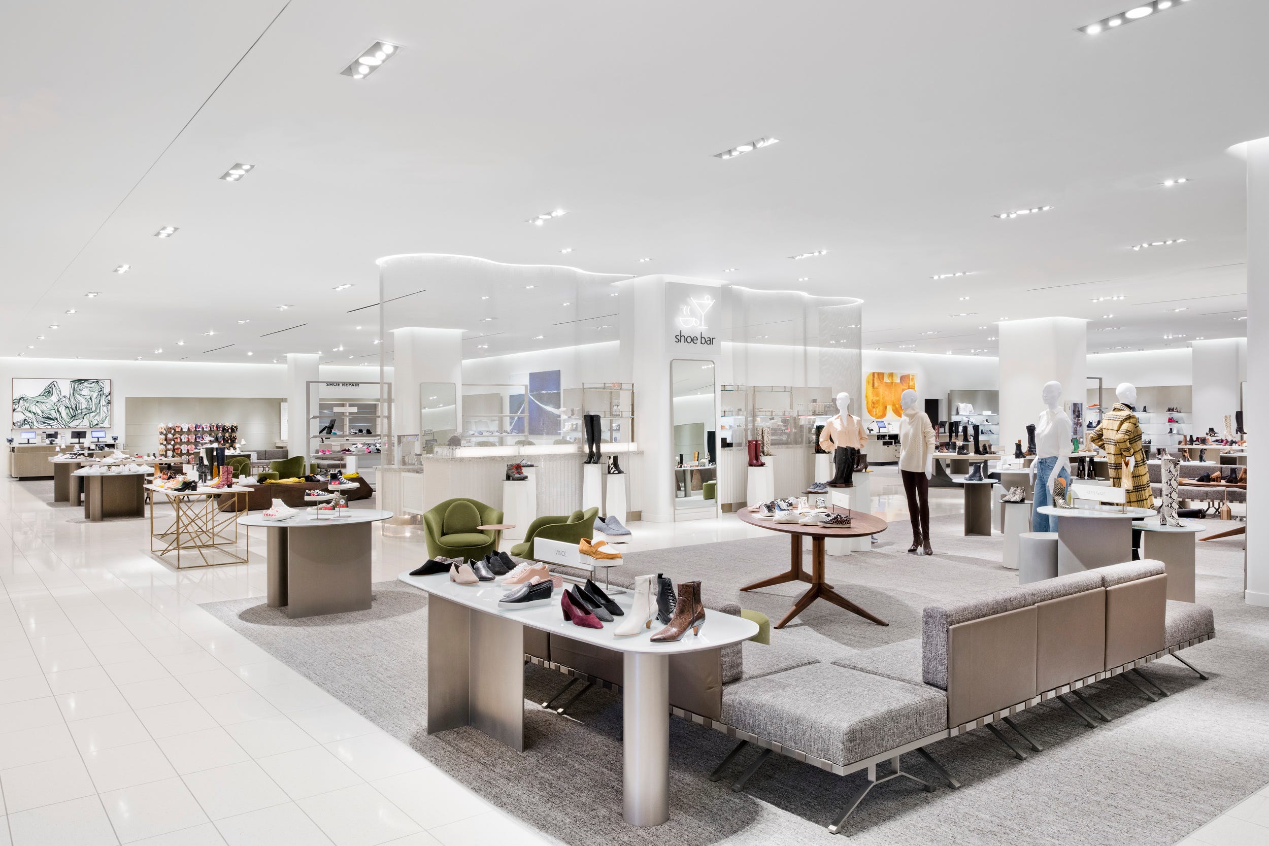
Over the past decade, Nordstrom has been the most willing of the megastores to embrace change, working with startup brands early on and attempting to bridge the digital with the analog using services like online order pickup. The new Manhattan location features a martini bar, repairs/alterations, and a myriad of beauty services (DryBar, Heyday, Face Gym, and BrowBar are all there for your massaging, blowing, plucking, and shellacking needs).

Inside Nordstrom NYC.
Yes, these are functional improvements to the shopping experience – and lightyears better than what PIEs are doing – but in every case, it’s as if someone talked to someone who knows a kid who said they like to “do things” while they shop.
The layouts are just as they have always been, organized in brand blocks with clothes hanging on racks and underpaid staff tasked with fetching out-of-sight inventory to be tried on in badly-lit dressing rooms. They’ve just added some unrelated services to the mix, generally food and beauty. Over $1 billion has been invested and every one of them played it safe, only marginally tweaking the existing department store concept.
What’s most shocking is that there is ample room to fundamentally improve retail, both by creating a more pleasant physical/visual experience and by considering functionality.
Why Do We Shop?
Let’s take it back to basics. Why does anyone shop offline instead of online? And how should those motivations be considered when rethinking retail?
-
Convenience: the ability to try, purchase, and take home a product immediately. E-commerce is lauded for its convenience over traditional retail, since consumers can shop anytime/anywhere without worrying about transit for themselves or their products, but the immediacy of offline can be a significant draw. Unfortunately this immediacy convenience is threatened by the trend towards decreasing store inventory (and Amazon’s one hour delivery drones).
-
Product testing: determining whether a product is the right fit (color, size, material, general use). Shoppers can try on products to find their size or determine if they like a material, but rarely get to trial them in a real-world environment. Nike and Canada Goose set examples by enabling consumers to test running shoes on a treadmill and coats in sub-zero temperatures, respectively, but these examples are rare
-
Entertainment: a way to fill time and feel good. Boredom and pleasure are key drivers of shopping as an activity. 96% of Americans admit to shopping for “therapy” and more than 33% said shopping made them “feel better than working out”. In this regard, ancillary services and photo-ops make sense. But there are so many more ways to entertain beyond beauty services and cafes (e.g., games, content) that hardly ever make it into a retail setting.
-
Socializing: a means of interacting with others and soliciting real-time feedback. If you’ve ever shopped for an important occasion, you know the value of going with a friend. But even though over half of shopping trips are made in groups (and consumers spend 20% more with friends), experiences are rarely tailored to support meaningful IRL social interaction. Instead, the focus is on social sharing online.
We can also look to e-commerce for ways to improve offline retail.
Education is a prime advantage of shopping online versus offline. Consumers can research product features, read reviews, compare prices, and check for deals. Retail salespeople can never compete with the boundless nature of the internet (not to mention that 95% of consumers do not want to talk to a salesperson in store) so shoppers already augment the offline experience themselves by searching on their smartphones (which is one reason so many necks are craned in stores). Sephora and Amazon’s 4-Star Store have made weak attempts to recreate this review and research experience offline, but there’s ample opportunity to unlock a more social and integrated shopping experience.
Functional Retail
There are plenty of annoyances inherent to shopping offline that brands could still address. Trying on apparel is cumbersome. Checkout lines are long. Transit time is inconvenient.
And there are opportunities for services beyond beauty and food that could provide actual value: childcare, dry cleaning, bike tune-ups, dog washing, etc.
There are also ways to entertain and delight beyond photo ops. Games, content, storytelling are just a few examples. Why should Netflix and YouTube have all the fun? What if the draw was less about share-ability and more about mystery/exclusivity/untethering?
Shopping has lost a lot of its luster. There’s ample room to improve and we don’t even have to wait for augmented reality to do it. We just need to spend more time thinking about real pain points and less about encouraging shoppers to promote their “personal brands”.